My Foray into Cover Design
For those of you who follow me on twitter, I'm sure you've noticed me talking about my book cover designing adventures.
See, I have this book that I wrote, (don't we all?) and I feel like I've moved on artistically, but I still love the book and would love to see it in print. It's a shame, because if I were to write it again, I know I could make it great, but I don't want to. At least not right now.
And the truth is, it is great. I just see it with a more critical eye than most.
All this is to say, that I'm looking to self publish quickly, and probably not with a lot of fanfare. I don't have the time and will-power to make a serious go of self publishing (i.e.: with all the publicity and whatnot) but I would love it if my book were out there in people's hands, whether or not it has a wide dispersal range.
So. To that end I've been laboring over a cover for my book for days now, and I've finally gotten something that looks great. But in the meantime, I've been obsessing over well-made covers and I thought I would share some of my favorite with you:
<<This version of Jules Verne's Journey to the Center of the Earth (apparently in Italian) is just fabulous. It's a series of paper cut-outs that are arranged into the levels of the story. It's eye-catching, and it tells a story, which is what you want.
I've notices that a lot of classic books have a billion and one redone covers, and I think it's kind of a fun exercise. If you want to make book covers, think of a classic in the public domain, and make your own cover for it.
This cover art was done by Carlo Giovani
 >> This one of Peter and the Wolf is just amazing. It took me a while to see the silhouette of the boy's head in the shape of the wolf's body, but even if you never notice that, the image is great.
You've got an interesting perspective, like a bird looking down on the whole thing, a story happening right in front of you, and a lot of great art.
This one actually looks like it's a movie poster, but same difference, really. If I had to change one thing, I would say the font should be something more substantial, maybe even something more... refined? to contrast with the savagery of the scene.
This one was done by Phoebe Morris
 <<Here we have another 'classic' story, I guess, with a new cover. Ian Fleming, famous for writing a bunch of the original James Bond novels, has had all of his books redone in this style. I love the font and the colors and everything about it.
I'm not a big fan of some aspects of the James Bond franchise that this poster plays on for reasons that are apparent to anyone who knows me, but I think these covers are very appropriate for the series.
These were designed by Michael Gillette and issued by Penguin.
 >>Normally, I like a cover because of how the art is done, but in this case, the cover tells such a great story, that it doesn't matter that I'm not too fond of the art style.
There's a lady pirate! And a tied up chef! What's going on! I've already made up a story in my head for this and I haven't even read the back of the book.
I love the idea of a lady pirate kidnapping a chef and making him cook her elaborate meals or whatever. Priceless!
This one was designed by Jennifer Carrow
 << This one I can't get over. I just can't. The title is Just In Case and the look on that dog's face, like he's a perpetual worrier.
This is the best.
I actually am not a big fan of that font, but the dogface more than makes up for it. Like, times a billion.
He's so worried for you! He wants you to be safe!
Designed by Clare Skeats.

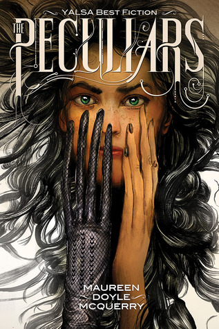
>>This book is kind of what got me started on this tear. Not only is the cover interesting and thought-provoking, but the whole inside of this book has the same half art-nouveau, half cyber-punk kind of lettering. and designs. The whole book is a work of art.
If you see it in a book store, stop a second and browse through it - it's amazing to look at. The cover illustration is by Greg Ruth

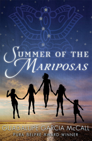
<< This cover is so intriguing, I have to read this book. Just look at it - LOOK AT IT. Half the story is already told - but you know you have something interesting waiting for you inside.
I don't know who designed this one, but you can find the book here.
I'll be posting my cover when it's done (aaahhh!) and you can all see it. There are so many more awesome book covers out there, but I feel like this post is long enough, so here I leave you.
Send me links to your favorite book covers!
PS - incidentally, I also have a Pinterest dedicated to this topic. check it out!
See, I have this book that I wrote, (don't we all?) and I feel like I've moved on artistically, but I still love the book and would love to see it in print. It's a shame, because if I were to write it again, I know I could make it great, but I don't want to. At least not right now.
And the truth is, it is great. I just see it with a more critical eye than most.
All this is to say, that I'm looking to self publish quickly, and probably not with a lot of fanfare. I don't have the time and will-power to make a serious go of self publishing (i.e.: with all the publicity and whatnot) but I would love it if my book were out there in people's hands, whether or not it has a wide dispersal range.
So. To that end I've been laboring over a cover for my book for days now, and I've finally gotten something that looks great. But in the meantime, I've been obsessing over well-made covers and I thought I would share some of my favorite with you:
<<This version of Jules Verne's Journey to the Center of the Earth (apparently in Italian) is just fabulous. It's a series of paper cut-outs that are arranged into the levels of the story. It's eye-catching, and it tells a story, which is what you want.
I've notices that a lot of classic books have a billion and one redone covers, and I think it's kind of a fun exercise. If you want to make book covers, think of a classic in the public domain, and make your own cover for it.
This cover art was done by Carlo Giovani
You've got an interesting perspective, like a bird looking down on the whole thing, a story happening right in front of you, and a lot of great art.
This one actually looks like it's a movie poster, but same difference, really. If I had to change one thing, I would say the font should be something more substantial, maybe even something more... refined? to contrast with the savagery of the scene.
This one was done by Phoebe Morris
I'm not a big fan of some aspects of the James Bond franchise that this poster plays on for reasons that are apparent to anyone who knows me, but I think these covers are very appropriate for the series.
These were designed by Michael Gillette and issued by Penguin.
There's a lady pirate! And a tied up chef! What's going on! I've already made up a story in my head for this and I haven't even read the back of the book.
I love the idea of a lady pirate kidnapping a chef and making him cook her elaborate meals or whatever. Priceless!
This one was designed by Jennifer Carrow
This is the best.
I actually am not a big fan of that font, but the dogface more than makes up for it. Like, times a billion.
He's so worried for you! He wants you to be safe!
Designed by Clare Skeats.

>>This book is kind of what got me started on this tear. Not only is the cover interesting and thought-provoking, but the whole inside of this book has the same half art-nouveau, half cyber-punk kind of lettering. and designs. The whole book is a work of art.
If you see it in a book store, stop a second and browse through it - it's amazing to look at. The cover illustration is by Greg Ruth

<< This cover is so intriguing, I have to read this book. Just look at it - LOOK AT IT. Half the story is already told - but you know you have something interesting waiting for you inside.
I don't know who designed this one, but you can find the book here.
I'll be posting my cover when it's done (aaahhh!) and you can all see it. There are so many more awesome book covers out there, but I feel like this post is long enough, so here I leave you.
Send me links to your favorite book covers!
PS - incidentally, I also have a Pinterest dedicated to this topic. check it out!
Saturday, April 26, 2014
|
Labels:
art,
Book Design,
books,
self-publishing,
The Osprey
|
Subscribe to:
Post Comments (Atom)
Copyright Emily Ever 2014. Powered by Blogger.
featured-content
About Me
I am a legit writer living in Durham, North Carolina, working at a publishing company, and ruthlessly fumigate for travel bugs on a daily basis. Follow my adventures as I try to get published, learn marketing voodoo, and pretend to be an adult.
Other Blogs
I have traveled a lot in the past teaching English and just being a general vagabond, so I have some blogs in my past. I will be consolidating them all - slowly but surely - into a single blog:
No Cilantro Extra Olives
This blog already contains my adventures in the Kingdom of Saudi Arabia, such as they are.
Updates on my other blogs, from Korea to India will be posted as I go through the laborious process of pulling them from their current blogs into that one.
No Cilantro Extra Olives
This blog already contains my adventures in the Kingdom of Saudi Arabia, such as they are.
Updates on my other blogs, from Korea to India will be posted as I go through the laborious process of pulling them from their current blogs into that one.
0 comments:
Post a Comment